This final project is based around the Open Psychometrics “Which Character” Quiz. The quiz follows a standard internet format: Respondents assess themselves on series of opposed traits (e.g., are you more selfish or altruistic?), and at the end of the quiz, they are presented with their most similar fictional character (e.g., Batman or Buffy the Vampire Slayer). After the quiz has been completed, users are invited to rate the personalities of the characters themselves (e.g., is Batman more altruistic or selfish?). Open Psychometrics researchers have aggregated the ratings of 2,125 characters across 500 dimensions on a 100-point scale. The aggregate ratings are based on 3,386,031 user responses. Our work is inspired by the work of the Vermont Computational Story Lab.
In this first notebook, we’ll import, clean, and prepare the data for exploration. We’ll conduct light exploration to assess the contents of the data. The dataset characters-aggregated-scores.csv was downloaded from Open Psychometrics. Supplemental datasets (to provide variable and character names) were developed based on the online documentation, which is available here as an .html file in the data folder. Note: If downloading an updated version of the dataset, the data formats, character names, and variables might have changed.
Imports
# importing data libraries
import pandas as pd
import numpy as np
import matplotlib.pyplot as plt
import seaborn as sns
import os
import plotly.express as px
import ipywidgets as widgets
from IPython.display import display
import random
# Custom installable package
import finaltools as ftReading the Data
# reading in the characters-aggregated-scores.csv, variable-key.csv, character-key.csv from the data folder
char_score_data = pd.read_csv("data/characters-aggregated-scores.csv", sep=",")
var_key = pd.read_csv("data/variable-key.csv")
char_key = pd.read_csv("data/character-key.csv")Looking at the Data
First, we’ll start by looking at the 3 main data sources, examining their shapes, and data types.
# start with characters-aggregated-scores.csv
ft.initial_data_look(char_score_data)Here are the first 5 rows of the data:
---------------------------------------------------------
The number of rows and columns in this dataset are (2125, 501)
---------------------------------------------------------
Here are the data types of each of the columns:
<class 'pandas.core.frame.DataFrame'>
RangeIndex: 2125 entries, 0 to 2124
Columns: 501 entries, id to BAP500
dtypes: float64(500), object(1)
memory usage: 8.1+ MB
None---------------------------------------------------------
Checking if there are any missing values: 0.0
# explore variable-key.csv
ft.initial_data_look(var_key)Here are the first 5 rows of the data:
---------------------------------------------------------
The number of rows and columns in this dataset are (500, 2)
---------------------------------------------------------
Here are the data types of each of the columns:
<class 'pandas.core.frame.DataFrame'>
RangeIndex: 500 entries, 0 to 499
Data columns (total 2 columns):
# Column Non-Null Count Dtype
--- ------ -------------- -----
0 ID 500 non-null object
1 scale 500 non-null object
dtypes: object(2)
memory usage: 7.9+ KB
None---------------------------------------------------------
Checking if there are any missing values: 0.0
# explore character-key.csv
ft.initial_data_look(char_key)Here are the first 5 rows of the data:
---------------------------------------------------------
The number of rows and columns in this dataset are (2125, 3)
---------------------------------------------------------
Here are the data types of each of the columns:
<class 'pandas.core.frame.DataFrame'>
RangeIndex: 2125 entries, 0 to 2124
Data columns (total 3 columns):
# Column Non-Null Count Dtype
--- ------ -------------- -----
0 id 2125 non-null object
1 name 2125 non-null object
2 source 2125 non-null object
dtypes: object(3)
memory usage: 49.9+ KB
None---------------------------------------------------------
Checking if there are any missing values: 0.0
By taking an initial look at the data, it aligns with the Open Psychometrics Quiz information. We see that for characters-aggregated-scores.csv, there are 2125 rows, 501 columns (which include an id column which is an object data type and BAP# ratings from 1-100), and no missing values. The variable-key.csv data set provides information about what the BAP# columns correspond to in terms of adjective pairs for the ratings. The character-key.csv provides information on the id column relating each row to the character and movie/novel source for that character.
The columns represent each dimension on which the characters were rated—or “binary adjective pairs” (BAPs). We’ll make these more legible using our var_key and provide actual names for the characters. We rename the columns based on the var_key, and then we drop a few specific columns: The authors used emojis for some of the BAPs, which are hard to interpret and cause problems with visualization, so they have been labeled “INVALID.” In addition, the authors accidentally included the “hard-soft” pair twice, so only the first pair is kept.
# merge character names and source from char_key to char_score_data
char_score_data = pd.merge(char_key, char_score_data, on="id")
# rename columns for readability
char_score_data.columns = ["id"] + ["character"] + ["source"] + var_key["scale"].to_list()
# omit 'INVALID' keys with emojis in their BAP names
char_score_data = char_score_data.loc[:,~char_score_data.columns.str.startswith('INVALID')]
# remove duplicated column names/BAPs
char_score_data = char_score_data.loc[:, ~char_score_data.columns.duplicated()]In the datafame below, the low end of the 100-point scale correspond to left-hand “adjective”, and vice versa.
# take another look at characters-aggregated-scores.csv after cleaning above
ft.initial_data_look(char_score_data)Here are the first 5 rows of the data:
---------------------------------------------------------
The number of rows and columns in this dataset are (2125, 467)
---------------------------------------------------------
Here are the data types of each of the columns:
<class 'pandas.core.frame.DataFrame'>
RangeIndex: 2125 entries, 0 to 2124
Columns: 467 entries, id to overthinker_underthinker
dtypes: float64(464), object(3)
memory usage: 7.6+ MB
None---------------------------------------------------------
Checking if there are any missing values: 0.0
After cleaning up the char_score_data, there are more readable column names with the BAPs being the names of the adjective pairs. It is also clear which characters and sources each id corresponds to. Another big change to note is that there are still the same number of rows because there are no missing values, but there is now 464 BAP columns rather than 500 after removing duplicates and INVALID entries.
# save the processed char_score_data in the data/processed folder
# make sure the folder exists
os.makedirs("data/processed", exist_ok=True)
# save as CSV
char_score_data.to_csv("data/processed/char_score_data.csv", index=False)Data Exploration
Most Right vs. Most Left BAPs
What if we want to know the 10 most charming and awkward characters in the dataset? The functions below allow you to input the data and the name of the column you’re most interested in. most_right() will print the highest scores for the right-hand term, while most_left() will print the highest scores for the left-hand term (which are technically the lowest scores on that dimension).
ft.most_right(char_score_data, "charming_awkward") character source charming_awkward
816 Emma Pillsbury Glee 93.1
1264 Mr. William Collins Pride and Prejudice 93.0
762 Tina Belcher Bob's Burgers 92.2
1016 Kirk Gleason Gilmore Girls 91.7
2063 Buster Bluth Arrested Development 91.6
909 Stuart Bloom The Big Bang Theory 91.4
1324 James The End of the F***ing World 91.3
345 Jonah Ryan Veep 90.8
2064 Tobias Funke Arrested Development 90.8
672 Morty Smith Rick and Morty 90.6
ft.most_left(char_score_data, "charming_awkward") character source charming_awkward
1142 Neal Caffrey White Collar 3.1
2092 James Bond Tommorrow Never Dies 4.4
248 Inara Serra Firefly + Serenity 4.8
556 Lucifer Morningstar Lucifer 6.4
1223 Frank Abagnale Catch Me If You Can 6.5
203 Don Draper Mad Men 6.7
1534 Damon Salvatore The Vampire Diaries 6.8
1545 Lagertha Vikings 6.9
207 Joan Holloway Mad Men 7.4
63 Derek Shepherd Grey's Anatomy 7.7
It is quite interesting that Emma Pillsbury from Glee is rated the most awkward character vs. Neal Caffrey is rated as the most charming.
Scores with Highest/Lowest Averages
Now let’s turn to exploring the Highest and Lowest averages for each character and also for BAP.
# look at average_rankings ACROSS all BAPs for a
char_score_data["average_rankings"] = char_score_data.iloc[:, 3:465].mean(axis=1)# explore overall min and max rankings
ft.explore_bap_averages(char_score_data, groups = False)# explore group ("source")-wise rankings and EDA
ft.explore_bap_averages(char_score_data, groups = True).head(10)It looks like overall the average_rankings across all the characters range from roughly 46 to 54, which makes sense that there isn’t much variation because all 462 binary adjective pairs (BAPs) cancel each other out at some point. Also, it’s important to note that on it’s own the average_rankings isn’t fully interpretable. Let’s look at BAP/column-wise averages instead.
# see the column-wise means for all the BAPs
bap_averages = char_score_data.iloc[:, 3:465].mean(axis=0).sort_values(ascending=False)
bap_averagesunambitious_driven 73.320988
neutral_opinionated 70.997647
shy_bold 70.918071
androgynous_gendered 70.769129
racist_egalitarian 69.652188
...
important_irrelevant 31.140424
devoted_unfaithful 30.839200
diligent_lazy 27.569694
motivated_unmotivated 26.370776
persistent_quitter 23.118024
Length: 462, dtype: float64# see a histogram of the bap_averages
s = bap_averages
# calculate summary statistics
min_val = s.min()
q1_val = s.quantile(0.25)
median_val = s.quantile(0.50)
q3_val = s.quantile(0.75)
max_val = s.max()
# corresponding indices
min_idx = s.idxmin()
max_idx = s.idxmax()
q1_idx = (s - q1_val).abs().idxmin()
median_idx = (s - median_val).abs().idxmin()
q3_idx = (s - q3_val).abs().idxmin()
# plot the histogram
plt.figure(figsize=(8, 5))
plt.hist(s.values, bins=30, alpha=0.7, color = "green")
# plot vertical lines
plt.axvline(min_val, linestyle="--", linewidth=2)
plt.axvline(q1_val, linestyle="--", linewidth=2)
plt.axvline(median_val, linestyle="-", linewidth=2)
plt.axvline(q3_val, linestyle="--", linewidth=2)
plt.axvline(max_val, linestyle="--", linewidth=2)
# create annotations
ymax = plt.ylim()[1]
plt.text(min_val, ymax * 0.95, f"{min_idx}", rotation=90, va="top", ha="right")
plt.text(q1_val, ymax * 0.95, f"{q1_idx}", rotation=90, va="top", ha="right")
plt.text(median_val, ymax * 0.95, f"{median_idx}", rotation=90, va="top", ha="right")
plt.text(q3_val, ymax * 0.95, f"{q3_idx}", rotation=90, va="top", ha="right")
plt.text(max_val, ymax * 0.95, f"{max_idx}", rotation=90, va="top", ha="right")
# make labels
plt.xlabel("BAP Average Score (1-100)")
plt.ylabel("Frequency")
plt.title("Distribution of BAP Average Scores with Min, Q1, Median, Q3, Max")
# create a visualizations folder to save this visualization if it doesn't exist
os.makedirs("visualizations", exist_ok=True)
# save the figure as bap_averages_histogram.png
plt.savefig("visualizations/bap_averages_histogram.png", dpi=300, bbox_inches="tight")
plt.show()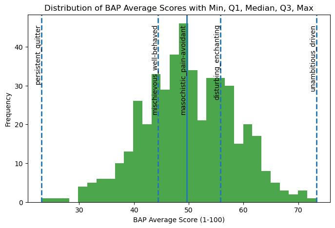
For “unambitious_driven,” the average ratings are skewed toward driven, suggesting that characters are generally perceived as driven rather than unambitious. In contrast, “persistent_quitter” shows ratings concentrated closer to persistent, indicating that characters are more often characterized as persistent than as quitters. Together, these patterns suggest that in movie character development, traits such as being driven and persistent are more commonly emphasized or recognized by viewers than their opposing traits.
# now let's look at the standard deviations
bap_std = char_score_data.iloc[:, 3:465].std(axis=0).sort_values(ascending=False)
bap_stdmasculine_feminine 27.308177
main-character_side-character 25.364726
hugs_handshakes 25.029397
parental_childlike 24.895246
sporty_bookish 24.396562
...
libertarian_socialist 10.879973
Greek_Roman 10.848932
Coke_Pepsi 10.646473
tautology_oxymoron 9.480700
right-brained_left-brained 6.735486
Length: 462, dtype: float64# plot a histogram of the standard deviations
plt.hist(bap_std, bins = 30)
# add labels and title
plt.title("Distribution of BAP Standard Deviations")
plt.xlabel("Standard Deviations")
plt.ylabel("Frequency")
# save the figure as bap_averages_histogram.png
plt.savefig("visualizations/bap_std_histogram.png", dpi=300, bbox_inches="tight")
# show the plot
plt.show()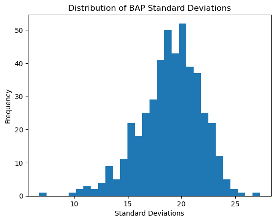
The BAP ratings seem to vary from their means as much as approximately 28 scores to about 6. While on average they seem to vary close to about 20 scores. BAPs like “right-brained left-brained” or “Coke Pepsi” might not be very hard to discern characters that are on the polar opposites since they aren’t very intuitive as to what a more right-brained person looks like or a more “Coke” person is. On the other hand, for BAPs like “masculine feminine” or “parental childlike”, it is clearer and more intuitive to understand what more female than male means or what being more of a main character than side character looks like.
Correlation Matrices
Now let’s explore correlation matrices between the BAP columns for a better understanding for the data before PCA.
# lets take another look at the BAP columns
char_score_data.iloc[:, 3:465].columnsIndex(['playful_serious', 'shy_bold', 'cheery_sorrowful', 'masculine_feminine',
'charming_awkward', 'lewd_tasteful', 'intellectual_physical',
'strict_lenient', 'refined_rugged', 'trusting_suspicious',
...
'sincere_irreverent', 'intuitive_analytical',
'cringing-away_welcoming-experience', 'stereotypical_boundary-breaking',
'energetic_mellow', 'hopeful_fearful', 'likes-change_resists-change',
'manic_mild', 'old-fashioned_progressive', 'gross_hygienic'],
dtype='object', length=462)# available columns
columns = char_score_data.iloc[:, 3:465].columns.tolist()
# widget for selecting 10 columns
column_selector = widgets.SelectMultiple(
options=columns,
value=columns[:10], # default selection is the first 10
description='Traits',
disabled=False
)
# interactive display
ft.interactive_correlation(char_score_data)462
# display a static version of the chart below (so it's viewable on GitHub as well)
# fixed 10 columns (similar to above)
static_columns = columns[:10]
# subset the data with chosen columns
subset = char_score_data[static_columns]
corr = subset.corr().round(2)
# plot heatmap
plt.figure(figsize=(10, 8))
sns.heatmap(
corr,
annot=True, # show correlation values
fmt=".2f", # round to 2 decimals
cmap="RdBu_r", # diverging red–blue
center=0, # center the colormap at 0
linewidths=0.5,
cbar_kws={'label': 'Correlation'}
)
# customize axis labels and title
plt.xticks(rotation=45, ha='right')
plt.yticks(rotation=0)
plt.title("Correlation Matrix of 10 (arbitrary) BAPs")
plt.tight_layout()
plt.savefig("visualizations/default_correlation_map.png", dpi=300, bbox_inches="tight")
# Show plot
plt.show()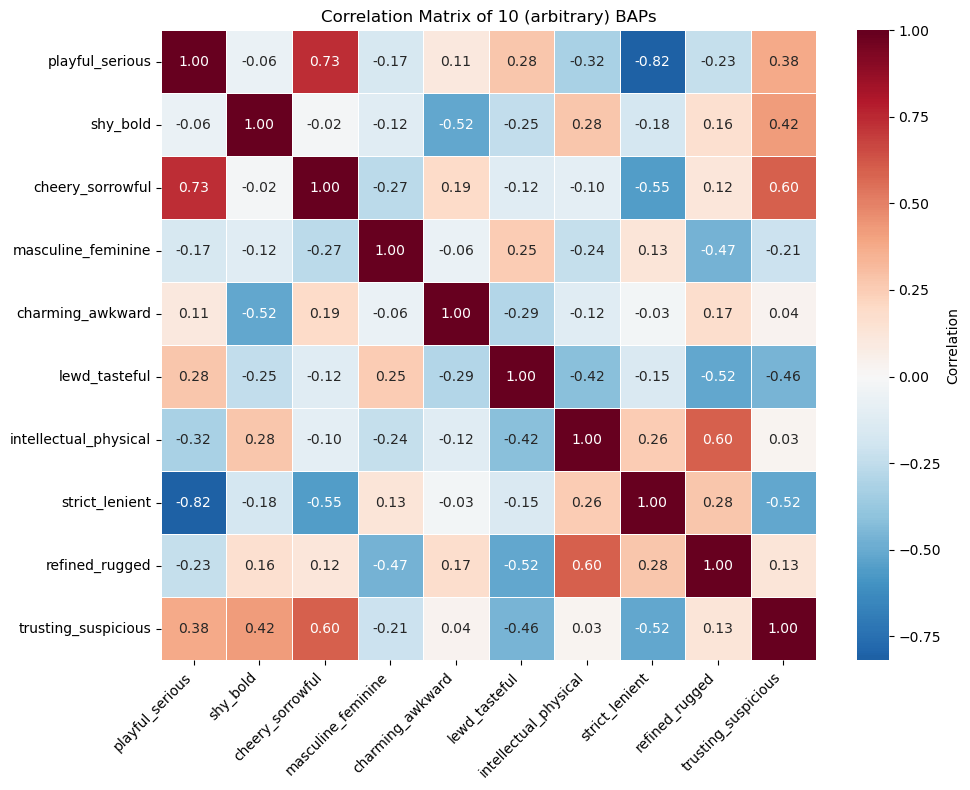
In the correlation matrix above, there are some variables that are very strongly correlated like playful_serious and strict_lenient are strongly negatively correlated (assuming they have a linear relationship). This makes sense because people who are more playful are likely also lenient while those who are serious are strict. There are also a lot of close to uncorrelated variables like trusting_suspicious and intellectual_physical where they don’t seem to be related in a certain way.
Group by Source Visualization
# lets look at the 10 largest groups of the sources
top_10_sources = char_score_data["source"].value_counts().head(10).index
top_10_sourcesIndex(['Harry Potter', 'The Wire', 'Game of Thrones', 'Battlestar Galactica',
'Gilmore Girls', 'The Simpsons', 'Ginny & Georgia',
'Marvel Cinematic Universe', 'Mad Men', 'Westworld'],
dtype='object', name='source')# graph the distribution of average rankings by source name
# update the dataframe to include the top 10 sources
top_10_source_df = char_score_data[char_score_data["source"].isin(top_10_sources)]
# plot it as a violinplot
sns.violinplot(data = top_10_source_df, y = "source", x = "average_rankings")
plt.title("Average Rankings Distribution of Top 10 Sources")
plt.xlabel("Average Rankings")
plt.ylabel("Source Name")
# save the figure output
plt.savefig("visualizations/average_rankings_for_top10_sources.png", dpi=300, bbox_inches="tight")
# show the plot
plt.show()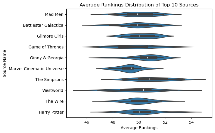
Here is the average rankings distribution for the top 10 sources or media sources with the most number of characters. While the average rankings roughly center around 50, characters in the Marvel Cinematic Universe have, on average, slightly lower ratings than average, while Westworld characters have higher ratings than the average.