In the Vermont Computational Story Lab’s analysis of the same dataset, they used “dimension reduction” to identify 6 key dimensions in the data that create 12 archetypes. However, because the replication code has not been made available, it is unclear what techniques they used to reduce the dimensionality of the data. In this section, we employ a mixture of principal component analysis (PCA), Gaussian mixture model (GMM), and hierarchical agglomerative clustering (HAC) to propose some potential archetypes.
Importing modules and data
# imports
import pandas as pd
import numpy as np
from sklearn.preprocessing import StandardScaler
from sklearn.decomposition import PCA
import matplotlib.pyplot as plt
from sklearn.mixture import GaussianMixture as GMM
from sklearn.cluster import AgglomerativeClustering
from scipy.cluster.hierarchy import linkage, cut_tree, dendrogram
import finaltools as ft
We read and clean the data using the steps outlined in Part 1.
# read processed data from part 1 notebook
data = pd.read_csv("data/processed/char_score_data.csv")
data.head()Principal Component Analysis (PCA)
For PCA, it’s important to scale variable values because we are comparing Euclidean distances. Technically, all of our variables should already be on the same scale, but this will become more important when we get to the self-organizing map, so we’ll scale them here for consistency. Robustness check: scaling the variables produces very similar results to the unscaled version. Just try running the PCA code without scaling the data!
data_values = data.iloc[:, 3:]
scaler = StandardScaler()
data_values = scaler.fit_transform(data_values)
Now data_values contains our scaled data. It’s time to see how many components we should have. This first technique is adapted from this tutorial. The author recommends that the number of components chosen should account for 95% of the variance. We’ll see why this is an issue in a moment.
pca_all = PCA(svd_solver="full").fit(data_values) # fit the PCA to the maximum number of componentsplt.rcParams["figure.figsize"] = (12,6)
xi = np.arange(1, 465, step=1)
y = np.cumsum(pca_all.explained_variance_ratio_) * 100
plt.ylim(0,110)
plt.plot(xi, y, marker='o', linestyle='--', color='b')
plt.xticks(np.arange(0, 465, step=25))
plt.xlabel('Number of Components')
plt.ylabel('Cumulative variance (%)')
plt.title('The number of components needed to explain variance')
plt.axhline(y=95, color='r', linestyle='-')
plt.text(5, 100, '95% cumulative variance', color = 'red', fontsize=16)
plt.grid(axis='x')
plt.savefig("visualizations/cumulative_variance_PCA.png")
plt.show()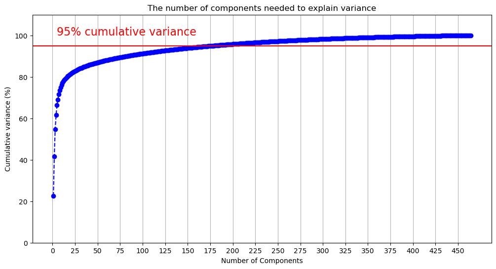
The above figure demonstrates that we will need many components to capture 95% of the variance. The code below outputs the first component where the cumulative variance exceeds 95%.
np.argmax(y > 95)np.int64(177)177 components doesn’t reduce the dimensionality of the data very much! Let’s flip the figure and see how much variance is captured by each component. Given our previous results, we’ll limit this to the first 50 components to make the data more legible.
component_variance = np.arange(pca_all.n_components_) + 1

plt.plot(component_variance[:50], pca_all.explained_variance_ratio_[:50] * 100, 'o-', linewidth=2, color='blue')
plt.title('Scree Plot')
plt.xlabel('Principal Component')
plt.ylabel('Variance Explained (%)')
plt.xticks(np.arange(0, 50, step=5))
plt.grid(axis='x')
plt.savefig("visualizations/scree_plot_PCA.png")
plt.show()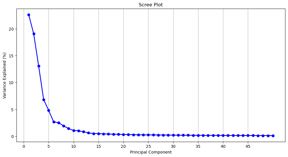
Another common dimension reduction strategy is to only select components from before the curve begins to flatten out, which would be 5 components. At 5 components, 66.4% of the variance is captured.
y[4] / 100 # variance at the 5th componentnp.float64(0.6638636017740732)Which of the 464 dimensions contribute the most to each of the components? To know this, we can access the component loadings. Loadings tell us both the magnitude and direction of a given dimension, which, together indicate how the dimension contributes to the presence of a given component: A (relatively) larger, positive loading suggests that that dimension contributes more to the presence of that component. We can access these components from our fitted PCA using the .components_ method.
pca_loadings = pca_all.components_.T # get the loadings

pca_loadings_df = pd.DataFrame(
    pca_loadings,
    index=data.columns[3:].to_list(),
    columns=[f"PC{i+1}" for i in range(pca_loadings.shape[1])]
)
pca_loadings_10 = pca_loadings_df.loc[pca_loadings_df["PC1"].abs().sort_values(ascending=False).index].head(10)
pca_loadings_10 = pca_loadings_10.reset_index().rename(columns = {"index": "BAP"})
pca_loadings_10Below, we retrieve the top 10 loadings from the first 15 components. We swap their values (e.g., 0.091049) for the dimension’s name (e.g., rude_respectful). Then, we add the loading’s sign (positive or negative) to the name. How do we interpret this? PC1’s top 2 loadings come from the dimensions +rude_respectful and -angelic_demonic. This tells us that both dimension contribute to the presence of PC1 but that they are inversely related. This should hopefully make sense: Someone who scores highly on respectful would be expected to score lower on demonic. When interpreting the dimensions, remember that the right-hand side corresponds to the higher scores, and the left-hand side corresponds to the lower scores. Interpreting the loadings, the first five components seem to get at the following dichotomies:
“good” vs “bad”
“serious” vs “silly”
“bland” vs “cool”
“refined” vs “rough”
“smart” vs “strong”
There are some components which speak to the questions posed in Part 2. PC4 contains rich_poor, as well as other dimensions indicating wealth. The component would seem to suggest that the rich are depicted as more “manicured”, “preppy”, and “lavish” (as opposed to “scruffy”, “punk-rock”, and “frugal”). Past the first five components, the groupings of terms become harder to interpret (and their explanatory power diminishes), but we see young_old make an appearance in PC7. Here “old” is aligned with “repulsive”, “comedic”, and “happy.” PC10 brings together masculine_feminine and straight_queer, with with queerness and feminity aligned. They are also aligned with “cat-person”, “androgynous”, “asexual”, “side-character”, and, oddly enough, “German.”
loadings = ft.loadings(pca_loadings_df)
comp_loadings_dimensions = pd.DataFrame(loadings)
comp_loadings_dimensionscomp_loadings_dimensions.to_csv("data/pca_comp_loadings.csv", index=False)For a quick sanity check, we can see how Bruce Wayne (aka Batman) stacks up against the average fictional character on each of these measures. Batman is close to the mean on the first, fourth, and fifth components, but he is one 1.26 standard deviations above the mean “seriousness” and nearly 1 standard deviation below the mean “blandness.”
You can use the lookup below to find a character of your choosing (if they’re in the dataset character-key.csv). Then input their index into the second cell below, which finds their scores in order of the five components above.
char_key = pd.read_csv("data/character-key.csv")
char_key.index[char_key["name"] == "Bruce Wayne"].to_list()
# this will give 2 numbers for characters who appear in multiple series,
# like Bruce Wayne in Gotham and The Dark Knight
[874, 941]scores = pca_all.transform(data_values)
character_scores = scores[941][0:5]
mean_scores = scores.mean(axis=0)[0:5]
std_scores = scores.std(axis=0)[0:5]
z_scores = (character_scores - mean_scores) / std_scores
z_scoresarray([-0.37252782, 1.25955851, -0.96757578, 0.43020426, 0.50828762])Clustering
Gaussian Mixture Models
While PCA reduces dimensions, it does not cluster our data. However, we can use PCA to cluster the data with reduced noise from excess dimensions. One way of clustering our data is through a Gaussian Mixture Model. This model is ideal for its probabilistic nature: It would allow us to have “soft” clusters, with some characters occupying the boundaries between multiple archetypes. To quickly test this model out, we can input the 177 components of our PCA (which explain 95% of the variance) and cluster our characters into one of two groups. We can plot each character on a scatterplot with the first two principle components as the axes.
pca_scores = scores[:, :177] # select first 177 components, change this to test other components

gmm = GMM(n_components=2, random_state=159, covariance_type="full").fit(pca_scores)
labels = gmm.predict(pca_scores)
scatter = plt.scatter(scores[:, 0], scores[:, 1], c=labels, s=40, cmap='viridis')
plt.legend(*scatter.legend_elements(), title="Clusters")
plt.xlabel("PC1")
plt.ylabel("PC2")
plt.title("GMM Clustering (2 Clusters)")
plt.savefig("visualizations/GMM_2_components.png")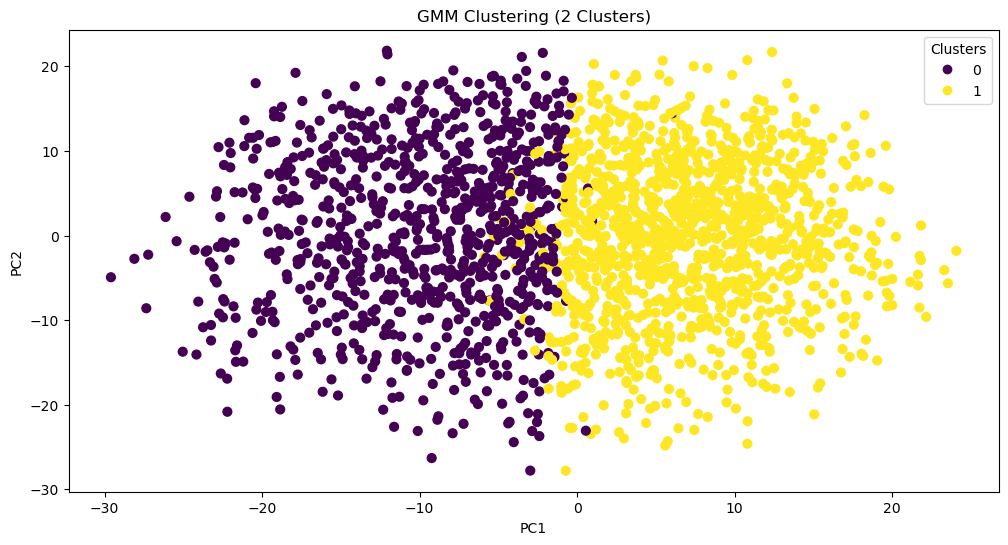
So far, that looks pretty good! What characters fall into each group? This might help us assess the viability of this method. We can assign cluster labels to the chracters using gmm.predict() and inputting each character’s score on the 177 components.
labels = gmm.predict(pca_scores) # retrieve cluster labels based on scores
data_clusters = data # create copy of the original dataset
data_clusters["GMM_cluster_2"] = labels # assign a new column with clusters
char_gmm2 = data_clusters[["character", "GMM_cluster_2"]][941:947]
print(char_gmm2)
character GMM_cluster_2
941 Bruce Wayne 0
942 Alfred Pennyworth 1
943 The Joker 0
944 James Gordon 1
945 Harvey Dent 0
946 Rachel Dawes 1
char_gmm2.to_csv("data/char_gmm2.csv", index=False)Looks like all the good guys and all the bad guys are clustered together...except Bruce Wayne. What’s driving these cluster assignments? To try and interpret this division, we can take the mean of every PCA component for each of the clusters (gmm.means_) and then reverse the dimensionality reduction with .inverse_transform. We reinstantiate our PCA with only the first 177 components to do this.
pca177 = PCA(n_components=177, svd_solver="full").fit(data_values) # fit the PCA to the number of components provided to the GMM
cluster_centers_original = pca177.inverse_transform(gmm.means_) # find the means in the original dimensional space
Now, we go through each cluster and retrieve the original dimensions with the highest absolute average. We still care about the direction of the sign though, so we print the mean value alongside the dimension name. It turns out that the two clusters are just the opposite of one another: Cluster 0 is defined by being more rude while Cluster 1 is more respectful.
for i, center in enumerate(cluster_centers_original):
    top = np.argsort(np.abs(center))[-5:]
    print(f"Cluster {i}:")
    for idx in top:
        print(data.columns[3:].to_list()[idx], center[idx])
Cluster 0:
rude_respectful -0.90848501438952
wholesome_salacious 0.9102933704149965
poisonous_nurturing -0.9118241177741682
naughty_nice -0.9135515721810906
angelic_demonic 0.9268963015825046
Cluster 1:
rude_respectful 0.6677719310792272
wholesome_salacious -0.6691011433128735
poisonous_nurturing 0.6702263023455916
naughty_nice 0.6714960487331381
angelic_demonic -0.6813049455018976
What if we do the same thing with more initial clusters?
gmm = GMM(n_components=6, random_state=159, covariance_type="full").fit(pca_scores)
labels = gmm.predict(pca_scores)
scatter = plt.scatter(scores[:, 0], scores[:, 1], c=labels, s=40, cmap='viridis')
plt.legend(*scatter.legend_elements(), title="Clusters")
plt.xlabel("PC1")
plt.ylabel("PC2")
plt.title("GMM Clustering (6 Clusters)")
plt.savefig("visualizations/GMM_6_components.png")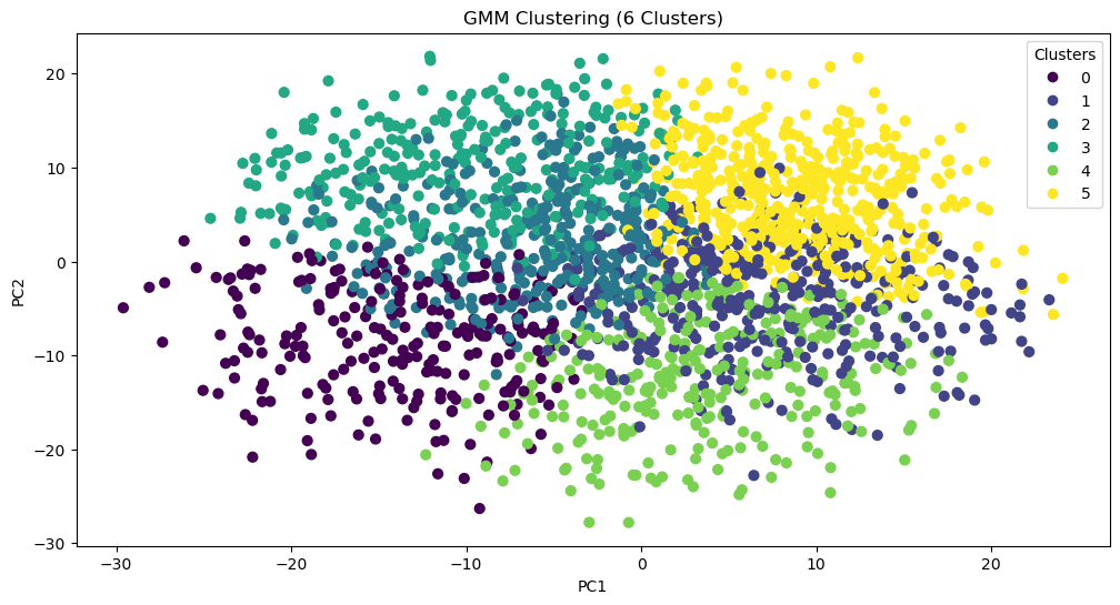
labels = gmm.predict(pca_scores) # retrieve cluster labels based on scores
data_clusters = data # create copy of the original dataset
data_clusters["GMM_cluster_6"] = labels # assign a new column with clusters
char_gmm6 = data_clusters[["character", "GMM_cluster_6"]][941:947]
print(char_gmm6)
character GMM_cluster_6
941 Bruce Wayne 2
942 Alfred Pennyworth 5
943 The Joker 2
944 James Gordon 5
945 Harvey Dent 3
946 Rachel Dawes 5
char_gmm6.to_csv("data/char_gmm6.csv", index=False)pca177 = PCA(n_components=177, svd_solver="full").fit(data_values) # fit the PCA to the number of components provided to the GMM
cluster_centers_original = pca177.inverse_transform(gmm.means_) # find the means in the original dimensional space
for i, center in enumerate(cluster_centers_original):
top = np.argsort(np.abs(center))[-5:]
print(f"Cluster {i}:")
for idx in top:
print(data.columns[3:].to_list()[idx], center[idx])Cluster 0:
ludicrous_sensible -1.4258973513848536
works-hard_plays-hard 1.450390984720145
competent_incompetent 1.4737446940755594
lewd_tasteful -1.4893664713199701
diligent_lazy 1.5453429519227389
Cluster 1:
hesitant_decisive -1.229542965909968
timid_cocky -1.2320720963973741
dominant_submissive 1.243468524001874
assertive_passive 1.2894857322056692
shy_bold -1.3913784915895415
Cluster 2:
maverick_conformist -0.9778032087470556
spicy_mild -0.9970935439066825
wild_tame -0.9998038258299139
obedient_rebellious 1.0265447574944488
tattle-tale_fuck-the-police 1.0449993578169918
Cluster 3:
open-minded_close-minded 1.3675472277193188
democratic_authoritarian 1.3748352164453137
protagonist_antagonist 1.3889034862462442
cruel_kind -1.4111948253980606
soulless_soulful -1.4644891912684297
Cluster 4:
cheery_sorrowful -1.2806673860232605
resentful_euphoric 1.2968685559063786
bubbly_flat -1.301286331945215
playful_serious -1.3065141937930955
open_guarded -1.3595837564941748
Cluster 5:
ludicrous_sensible 1.02199526147885
stable_unstable -1.0272058392071326
factual_exaggerating -1.0313798432912424
deranged_reasonable 1.0352385760146183
juvenile_mature 1.0615990016387764
With three times as many clusters, Bruce Wayne’s allies all remain in the same group (one now defined by being sensible, stable, factual, reasonable, and mature). Meanwhile, Harvey Dents splits off, and The Joker and Bruce Wayne stay together. This suggests that, perhaps, a better technique for clustering the data would be hierarchical.
Hierarchical Clustering
While hierarchical clustering will employ different methods for differentiating clusters (and thus, is unlikely to replicate the clusters found through GMM), this is actually the reason for attempting to cluster the data with it: Perhaps what we need is a hierarchical approach to show how certain categories break down. We’ll start by plotting a dendrogram to give us a sense of the shape of the data.
plt.figure(figsize = (20,10))
plt.title('Dendrograms')
# plot and save dendrogram
dend = dendrogram(linkage(scores[:, 0:177], method="ward", metric="euclidean"))
plt.savefig("visualizations/HCA_complete_dendrogram.png")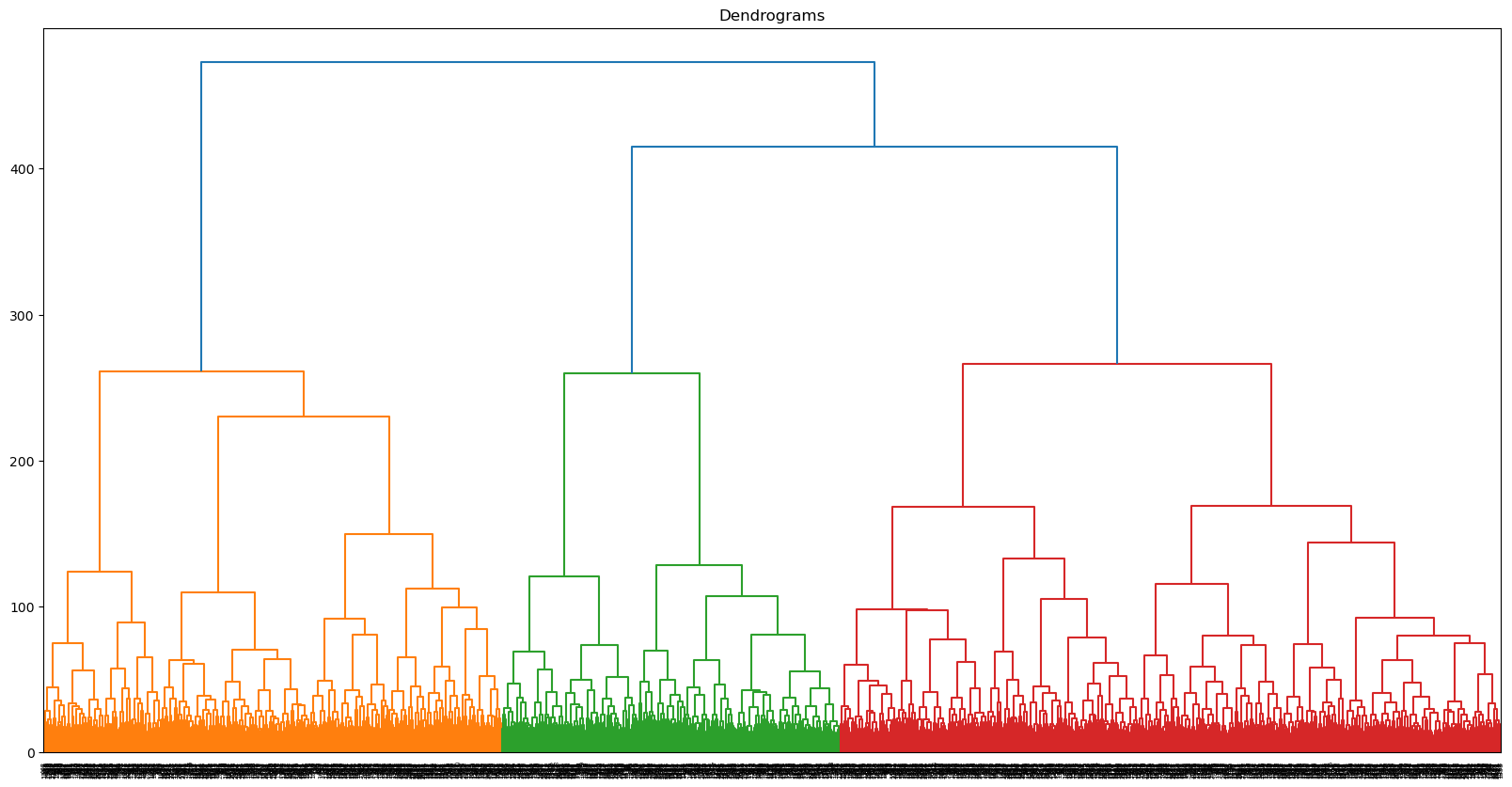
Let’s start, as we did with GMM, by dividing the data into two clusters. We are still using the 177 components identified earlier.
h_cluster = AgglomerativeClustering(
    n_clusters=2,
    metric='euclidean',
    linkage='ward',
    compute_full_tree=True).fit(pca_scores)
We can add the cluster labels to the previous cluster dataframe we had made during GMM. Now, we can compare the clusters assigned to each character.
data_clusters['HAC_cluster_2']=h_cluster.labels_
gmm_vs_hier = data_clusters[["character", "GMM_cluster_2", "HAC_cluster_2"]][941:947]
print(gmm_vs_hier)
character GMM_cluster_2 HAC_cluster_2
941 Bruce Wayne 0 0
942 Alfred Pennyworth 1 0
943 The Joker 0 1
944 James Gordon 1 0
945 Harvey Dent 0 0
946 Rachel Dawes 1 0
gmm_vs_hier.to_csv("data/gmm_vs_hier.csv", index=False)Seems like The Joker is all alone in his own cluster. What differentiates these two groups? We can create a new dataframe with the clusters as columns and the original dimensions as rows—just like we did with our PCA. Repurposing that code, we can figure out which dimensions differentiate the clusters based on their average scores.
# create the cluster dataframe
data_values_hclust = pd.DataFrame(data_values, columns=data.columns[3:467].to_list())
data_values_hclust["hclust1"] = h_cluster.labels_

# find the mean for each cluster
cluster_means = data_values_hclust.groupby('hclust1').mean()

# track the dimensions with the highest means within the cluster
clust_deter = {}

for i in range(0, 2):

    # get top dimensions by absolute mean
    top_idx = (cluster_means.T[i].abs().sort_values(ascending=False).head(11).index)

    # add sign (i.e., direction) to dimension names
    signed_dims = [
        f"{'+' if cluster_means.T.loc[idx, i] >= 0 else '-'}{idx}"
        for idx in top_idx
    ]

    clust_deter[i] = signed_dims

cluster_dimensions = pd.DataFrame(clust_deter)
cluster_dimensionscluster_dimensions.to_csv("data/hier_cluster_dim.csv", index=False)Seems like the highest scoring dimensions speak for themselves: it’s a difference between order and chaos, scandalous and proper, and caution and impulse. The Joker certainly seems to make sense on the side of chaos.
Now we can enter into the hierarchy again, this time once 7 groups have been created, and run the same analysis.
h_cluster = AgglomerativeClustering(
    n_clusters=7, # change the number of clusters
    metric='euclidean',
    linkage='ward',
    compute_full_tree=True).fit(pca_scores)
data_clusters["HAC_cluster_7"]=h_cluster.labels_
gmm_vs_hier7 = data_clusters[["character", "HAC_cluster_2", "HAC_cluster_7"]][941:947]
print(gmm_vs_hier7) character HAC_cluster_2 HAC_cluster_7
941 Bruce Wayne 0 2
942 Alfred Pennyworth 0 0
943 The Joker 1 6
944 James Gordon 0 2
945 Harvey Dent 0 2
946 Rachel Dawes 0 0
gmm_vs_hier7.to_csv("data/gmm_vs_hier7.csv", index=False)# create the cluster dataframe
data_values_hclust = pd.DataFrame(data_values, columns=data.columns[3:467].to_list())
data_values_hclust["hclust1"] = h_cluster.labels_
# find the mean for each cluster
cluster_means = data_values_hclust.groupby('hclust1').mean()
# track the dimensions with the highest means within the cluster
clust_deter = {}
for i in range(0, 7):
# get top dimensions by absolute mean
top_idx = (cluster_means.T[i].abs().sort_values(ascending=False).head(11).index)
# add sign (i.e., direction) to dimension names
signed_dims = [
f"{'+' if cluster_means.T.loc[idx, i] >= 0 else '-'}{idx}"
for idx in top_idx
]
clust_deter[i] = signed_dims
cluster_dimensions = pd.DataFrame(clust_deter)
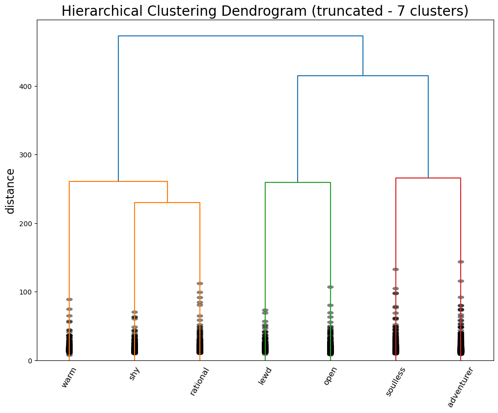
cluster_dimensionscluster_dimensions.to_csv("data/hier_cluster_dim7.csv", index=False)The Joker stays on his lonesome, but his new cluster is defined by “adventurous”, “rebellious”, and “fuck the police”—so it seems like an appropriate place for him. Meanwhile, the agents of order have been split into two camps: butler Alfred Pennyworth and district attorney / love interest Rachel Dawes are “warm”, “angelic”, and “nurturing”, while vigilante Bruce Wayne, lawyer-turned-killer Harvey Dent, and police commissioner James Gordon are all “rational”, “no nonsense”, and “mature.”
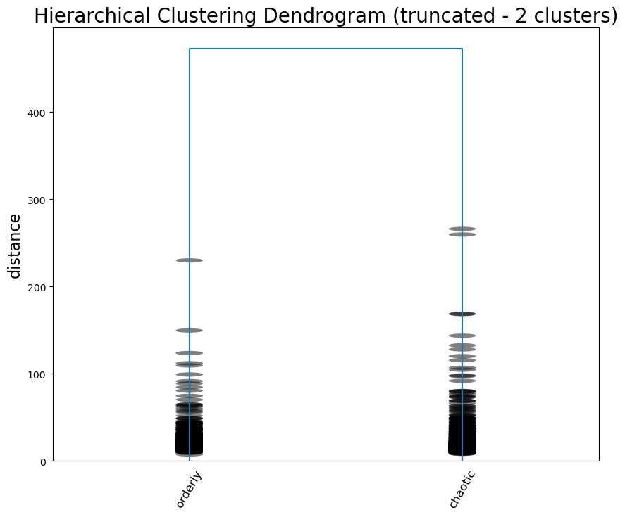
For a final attempt at interpreting the data, we can label each “leaf” of the tree with the most prominent dimension and cut the tree off to visualize the hierarchy. This code is (very minorly) adapted from stack overflow.
labels = ["orderly", "chaotic"]
linked = linkage(scores[:, 0:177], method="ward", metric="euclidean")
p = len(labels)

plt.figure(figsize=(10,8))
plt.title('Hierarchical Clustering Dendrogram (truncated - 2 clusters)', fontsize=20)
plt.ylabel('distance', fontsize=16)

# call dendrogram to get the returned dictionary
# (plotting parameters can be ignored at this point)
R = dendrogram(
                linked,
                truncate_mode='lastp',  # show only the last p merged clusters
                p=p,  # show only the last p merged clusters
                no_plot=True,
                )

print("values passed to leaf_label_func\nleaves : ", R["leaves"])

# create a label dictionary
temp = {R["leaves"][ii]: labels[ii] for ii in range(len(R["leaves"]))}
def llf(xx):
    return "{}".format(temp[xx])

dendrogram(
            linked,
            truncate_mode='lastp',  # show only the last p merged clusters
            p=p,  # show only the last p merged clusters
            leaf_label_func=llf,
            leaf_rotation=60.,
            leaf_font_size=12.,
            show_contracted=True,  # to get a distribution impression in truncated branches
            )
plt.savefig("visualizations/HCA_2cluster_dendrogram.png")
plt.show()
values passed to leaf_label_func
leaves : [4245, 4247]
labels = ["warm", "shy", "rational", "lewd", "open", "soulless", "adventurer"]
linked = linkage(scores[:, 0:177], method="ward", metric="euclidean")
p = len(labels)

plt.figure(figsize=(12,9))
plt.title('Hierarchical Clustering Dendrogram (truncated - 7 clusters)', fontsize=20)
plt.ylabel('distance', fontsize=16)

# call dendrogram to get the returned dictionary
# (plotting parameters can be ignored at this point)
R = dendrogram(
                linked,
                truncate_mode='lastp',  # show only the last p merged clusters
                p=p,  # show only the last p merged clusters
                no_plot=True,
                )

print("values passed to leaf_label_func\nleaves : ", R["leaves"])

# create a label dictionary
temp = {R["leaves"][ii]: labels[ii] for ii in range(len(R["leaves"]))}
def llf(xx):
    return "{}".format(temp[xx])

dendrogram(
            linked,
            truncate_mode='lastp',  # show only the last p merged clusters
            p=p,  # show only the last p merged clusters
            leaf_label_func=llf,
            leaf_rotation=60.,
            leaf_font_size=12.,
            show_contracted=True,  # to get a distribution impression in truncated branches
            )
plt.savefig("visualizations/HCA_7cluster_dendrogram.png")
plt.show()
values passed to leaf_label_func
leaves : [4236, 4232, 4240, 4235, 4237, 4241, 4242]
Where does this leave us? Certainly, we did not produce the same archetypes as the Vermont Computational Story Lab (CSL). Their 6 major dimensions are roughly approximated by our 5 components derived via PCA, but they were not exact. These axes seemed more true to what we might consider “archetypes”: PC5, for example, described tropes of characters defined by their brains or their brawn, which corresponds to CSL’s “brute vs geek” dimension. When it came to GMM, the major distinctions didn’t capture the heroes vs the villains, but seemed to capture a general personality difference. The more psychological aspects of the character archetypes became clear with the hierarchical clustering. This makes sense given the fact that Open Psychometrics relies on personality-based metrics—it’s even in the name.
With some interpretive leverage, we could identity the major differentiation between characters as whether or not they are agents of order or chaos—an important distinction in how characters move plots along. On the side of order, there are characters defined by their warmth and kindness, their shyness and meekness, or their wise rationality. On the side of chaos, there are characters defined by their perversion, their gregariousness and charm, their cruelty and villainy, and their wild rebelliousness.