To answer this quesiton, I’ll be looking into an interaction model using affordability_ratio ~ median_income x region_name
Assumptions and Limitations for this question: I’ll be fitting an OLS interaction model that tests if median income and affordability ratio’s relationship differs by region. Since this is an obersvational and aggregated dataset, the results I get will be descriptive based on the data and not causal. Also, since this dataset is aggregated, the results I get could be more smoothed and have less variation than if I had a bunch of much mroe raw data.
OLS assumes independent observations, linear relationship, and homoskedasticity. Because the affordability ratio is right-skewed as mentioned before and the model may not extrapolate well, I restricted the interaction plot to the smaller range as described in the code below, which is 5th to 95th percentile.
import numpy as np
import pandas as pd
from pathlib import Path
import matplotlib.pyplot as plt
import seaborn as sns
import statsmodels.formula.api as smf

RANDOM_STATE = 159
np.random.seed(RANDOM_STATE)

DATA_PATH = Path("./data/food_affordability.csv")
OUT_DIR = Path("./outputs"); OUT_DIR.mkdir(exist_ok=True)
FIG_DIR = Path("./figures"); FIG_DIR.mkdir(exist_ok=True)

df_2 = pd.read_csv(DATA_PATH)
df_2.head()

# For preprocessing, I only kept the top 6 regions. I did the same with the getting rid of large outliers as RQ2.
df_rq3 = df_2[["affordability_ratio", "median_income", "region_name"]].dropna().copy()
upper = df_rq3["affordability_ratio"].quantile(0.99)
df_rq3 = df_rq3[df_rq3["affordability_ratio"] <= upper].copy()
df_rq3["income_c"] = df_rq3["median_income"] - df_rq3["median_income"].mean()
TOP_N = 6
top_regions = df_rq3["region_name"].value_counts().head(TOP_N).index
df_rq3_plot = df_rq3[df_rq3["region_name"].isin(top_regions)].copy()

df_rq3_plot["region_name"] = df_rq3_plot["region_name"].astype("category")


model_int = smf.ols(
    "affordability_ratio ~ income_c * C(region_name)",
    data=df_rq3_plot
).fit()

print(model_int.summary())
OLS Regression Results
===============================================================================
Dep. Variable: affordability_ratio R-squared: 0.356
Model: OLS Adj. R-squared: 0.353
Method: Least Squares F-statistic: 145.6
Date: Thu, 18 Dec 2025 Prob (F-statistic): 4.04e-267
Time: 03:30:21 Log-Likelihood: -226.69
No. Observations: 2912 AIC: 477.4
Df Residuals: 2900 BIC: 549.1
Df Model: 11
Covariance Type: nonrobust
==================================================================================================================
coef std err t P>|t| [0.025 0.975]
------------------------------------------------------------------------------------------------------------------
Intercept 0.2750 0.011 25.359 0.000 0.254 0.296
C(region_name)[T.Monterey Bay] 0.0374 0.025 1.468 0.142 -0.013 0.087
C(region_name)[T.Sacramento Area] -0.0260 0.019 -1.371 0.170 -0.063 0.011
C(region_name)[T.San Diego] -0.0305 0.023 -1.330 0.183 -0.075 0.014
C(region_name)[T.San Joaquin Valley] -0.0326 0.019 -1.670 0.095 -0.071 0.006
C(region_name)[T.Southern California] 0.0465 0.013 3.496 0.000 0.020 0.073
income_c -3.073e-06 2.64e-07 -11.637 0.000 -3.59e-06 -2.55e-06
income_c:C(region_name)[T.Monterey Bay] -1.128e-05 1.23e-06 -9.162 0.000 -1.37e-05 -8.87e-06
income_c:C(region_name)[T.Sacramento Area] -3.45e-06 8.8e-07 -3.920 0.000 -5.18e-06 -1.72e-06
income_c:C(region_name)[T.San Diego] -5.176e-06 1.22e-06 -4.230 0.000 -7.58e-06 -2.78e-06
income_c:C(region_name)[T.San Joaquin Valley] -1.634e-05 9.06e-07 -18.041 0.000 -1.81e-05 -1.46e-05
income_c:C(region_name)[T.Southern California] -2.537e-06 3.87e-07 -6.558 0.000 -3.3e-06 -1.78e-06
==============================================================================
Omnibus: 3045.805 Durbin-Watson: 1.665
Prob(Omnibus): 0.000 Jarque-Bera (JB): 158672.435
Skew: 5.312 Prob(JB): 0.00
Kurtosis: 37.567 Cond. No. 2.01e+05
==============================================================================
Notes:
[1] Standard Errors assume that the covariance matrix of the errors is correctly specified.
[2] The condition number is large, 2.01e+05. This might indicate that there are
strong multicollinearity or other numerical problems.
low, high = df_rq3_plot["median_income"].quantile([0.05, 0.95])
income_grid_raw = np.linspace(low, high, 100)

income_grid = income_grid_raw - df_rq3_plot["median_income"].mean()
pred_frames = []
for r in top_regions:
    tmp = pd.DataFrame({
        "income_c": income_grid,
        "region_name": r
    })
    tmp["pred_affordability"] = model_int.predict(tmp)
    pred_frames.append(tmp)

pred_df = pd.concat(pred_frames, ignore_index=True)
plt.figure(figsize=(10, 6))
for r in top_regions:
    sub = pred_df[pred_df["region_name"] == r]
    plt.plot(income_grid_raw, sub["pred_affordability"], label=r)
plt.xlabel("Median Income")
plt.ylabel("Predicted Affordability Ratio")
plt.title("Interaction: Predicted Affordability vs Income by Region")
plt.legend(title="Region", bbox_to_anchor=(1.02, 1), loc="upper left")
plt.tight_layout()
model_no_int = smf.ols(
    "affordability_ratio ~ income_c + C(region_name)",
    data=df_rq3_plot
).fit()

from statsmodels.stats.anova import anova_lm
anova_cmp = anova_lm(model_no_int, model_int)
anova_cmpAfter comparing the model that uses income + region to the interactive model, the income x region, with this statsmodel’s test, we can see that there’s a statistically significant improvement in fit when we use the interactive terms, since our F value is 80.5 and the p value is very small. This is significant evidence that the relationship between income and food affordability is different across regions.
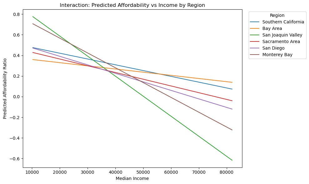
RQ3 Results (Income × Region)
As you can see in the figure, the interaction model lets the affordability ratio slope change from region to region. Compared to the additivie income + region model shows that the interaction plot improves fit significantly. The clear differences in the slopes shows that the association between income and affordability is not the same across California regions.
fig_path = FIG_DIR / "rq3_income_region_interaction.png"

plt.figure(figsize=(10, 6))
for r in top_regions:
    sub = pred_df[pred_df["region_name"] == r]
    plt.plot(sub["income_c"] + df_rq3_plot["median_income"].mean(), sub["pred_affordability"], label=r)

plt.xlabel("Median Income")
plt.ylabel("Predicted Affordability Ratio")
plt.title("Interaction: Predicted Affordability vs Income by Region")
plt.legend(title="Region", bbox_to_anchor=(1.02, 1), loc="upper left")
plt.tight_layout()
plt.savefig(fig_path, dpi=150)
plt.show()

fig_path
PosixPath('figures/rq3_income_region_interaction.png')